Overview
The Todos page is the heart of Holltask. This is the part of the app I use the most, and where the "notepad" inspiration really shows up—it's built to be clean, fast, and distraction‑free.
A Clean, Centered Todo List
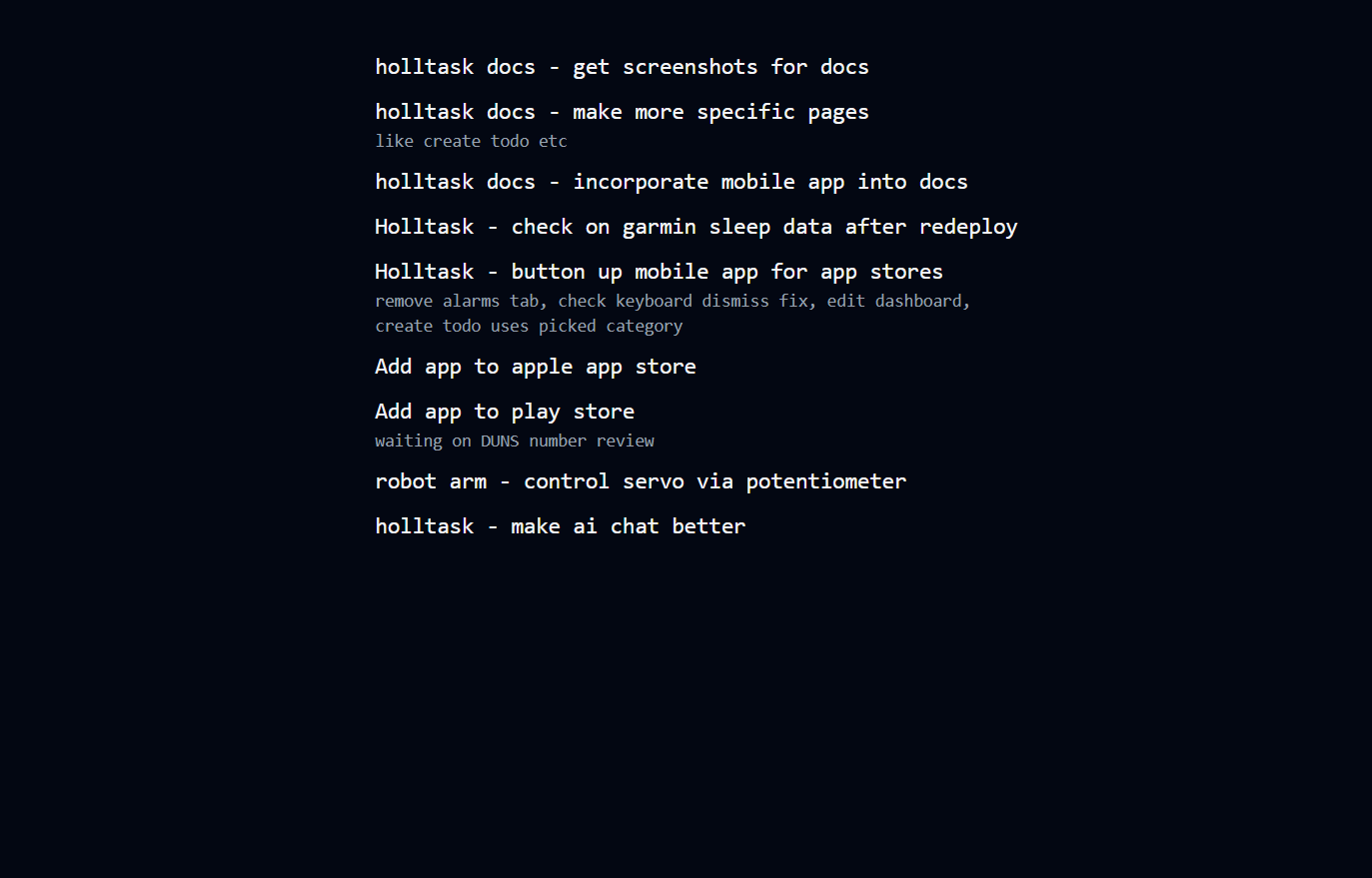
When you open the Todos page, all you see are your tasks, centered on the screen with nothing noisy around them. No sidebars full of filters, no giant toolbars—just the list of what you need to do.
That simplicity is intentional. I wanted it to feel like writing in a plain text file, but with just enough structure to actually be useful long‑term.
How Interaction Works
Hover to See Details
Each todo starts out minimal so the list stays easy to scan. When you hover over a todo, more details slide into view, such as:
- Status
- Priority
- Category
- Due date (if you've set one)
- Created date
This keeps the list visually light most of the time, but gives you more context the moment you care about a specific item.
Hover to Reveal Controls
If you move your mouse toward the top of the page, the usual table controls appear, including things like:
- Filtering and sorting options
- Toggles to show completed vs. active todos
When you move your mouse away from that area, those controls hide again so you're back to just seeing your todos. The idea is that the tools are there when you need them, but they don't live in your face all the time.

Why I Like This Flow
This design makes it easy to:
- Stay focused on the next thing you need to do
- Drill into details only when you want them
- Manage the list without cluttering the screen
It still has the power of a real task system, but it keeps the same feeling I liked from my old workflow of writing todos in notepad and deleting them as I went—simple, quick, and easy to come back to.